HealthPort
Using technology to facilitate end-to-end solutions for improved oxygen access in Nigeria
Overview
Challenge
Design a dashboard that provides users information and filtering options to find the facility closest to them with the medical assistance and devices they need.
Client
HealthPort
Aiming to improve access to quality medical care by using digitized solutions to efficiently manage care coordination and resource availability for improved oxygen access in Nigeria.
Solution
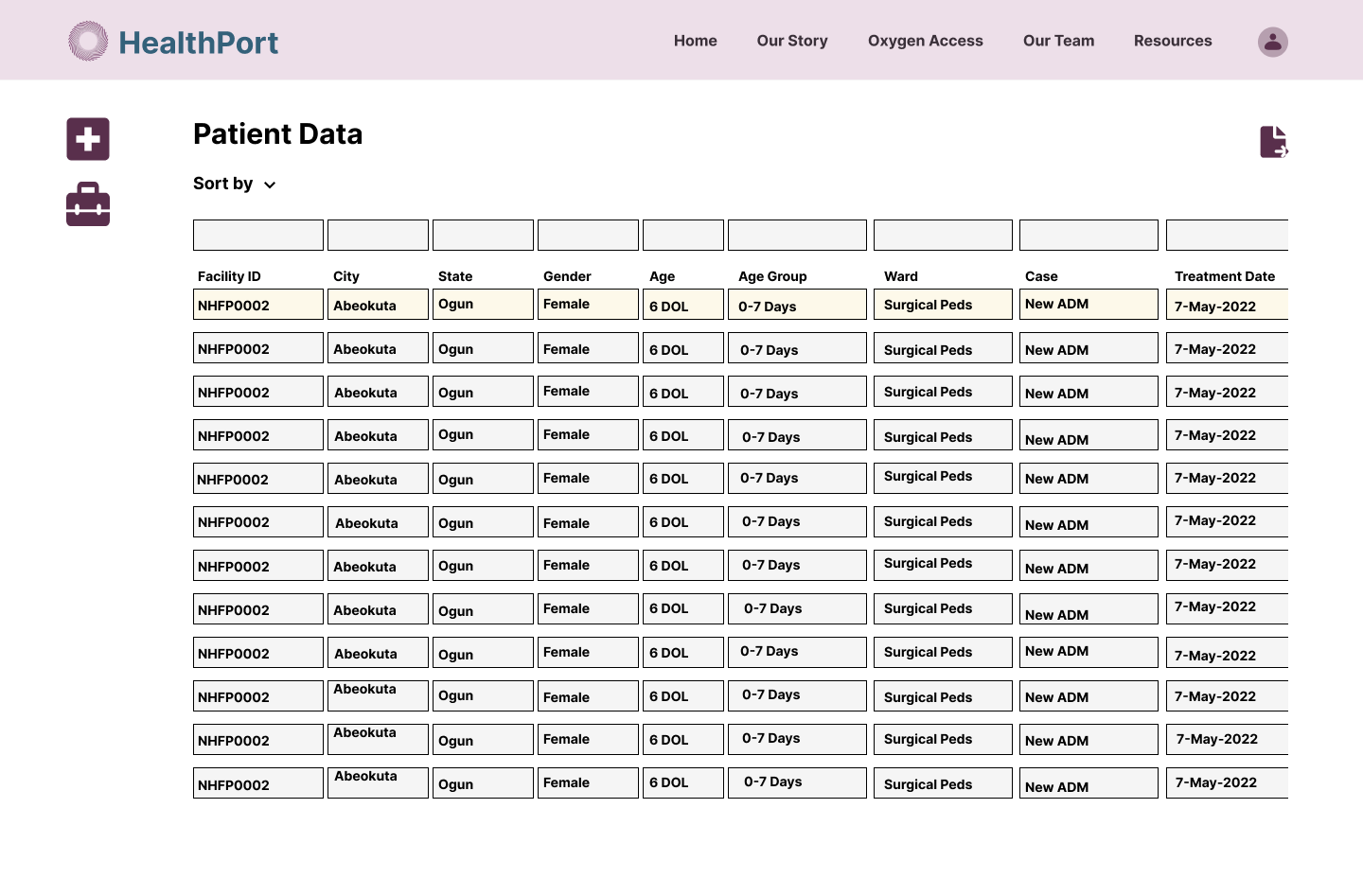
A 3 part interface consisting of dashboard of oxygen availability for users, a data entry form for clinical support staff, and a backend summary table to track patient and equipment data.
Info
Roles
Project Manager, UX Researcher, UI Designer
Tools
Figma, Trello
Duration
3 Weeks
Understanding the Problem
What are we trying to solve?
1.
2.
Expedite locating oxygen
Users stated that it can take up to 7 days to receive treatment for hypoxemia (low level of oxygen in the blood).
Users cited had to travel to multiple hospitals before finding a facility that had oxygen supply to accommodate their needs.
Provide live & accurate data
Users reported that Nigerian hospitals currently have no way of providing information regarding oxygen and equipment supply levels to patients prior to their arrival on-site.
The supply of oxygen or availability of equipment at a hospital is unknown until they arrive in person.
Hypothesis
By creating a solution that allows healthcare staff to track and update oxygen and equipment availability, patients can efficiently find care they need and increase their chances of survival.
User Research
1
3
How long does it take you to find the care you need?
When asked, users stated that it can take 5-7 days to find a facility that has oxygen.
How important is the timing of accessing oxygen?
The timing depends on the case, if it’s an emergency someone could need it within the hour, so finding it quickly becomes exponentially more important.
Comparative Analysis
There are times when they go to a facility and there is no bed space for patients or all the oxygen stands are being used.
Priority
Identifying Opportunities & Feature Prioritization
To come up with our solution, we compiled a list of features that we wanted to include in our design from main comparators in similar industries. We looked at how they provide data to patients and from there we broke them down into 3 categories:
1. Search by an address or location
2. Location information CTA
3. Map and List view for locations
2
Can you describe the process of finding oxygen care?
Important
1. Current Location
2. Directions from current location
3. Filtering options for location
Nice to Have
1. Legend / Map Key
2. Satellite Map Option
3. Product Type
4. Slider Bar for Result Distance
The reason that we prioritized search by location, location information and map/list view was because these were the most common pain points we found among users during our research.
Solution
The solution we came up with is comprised of 3 separate interfaces. These interfaces interact to provide patients with the information they need.
Oxygen Dashboard
A patient facing dashboard with locations of facilities and their oxygen supply availability
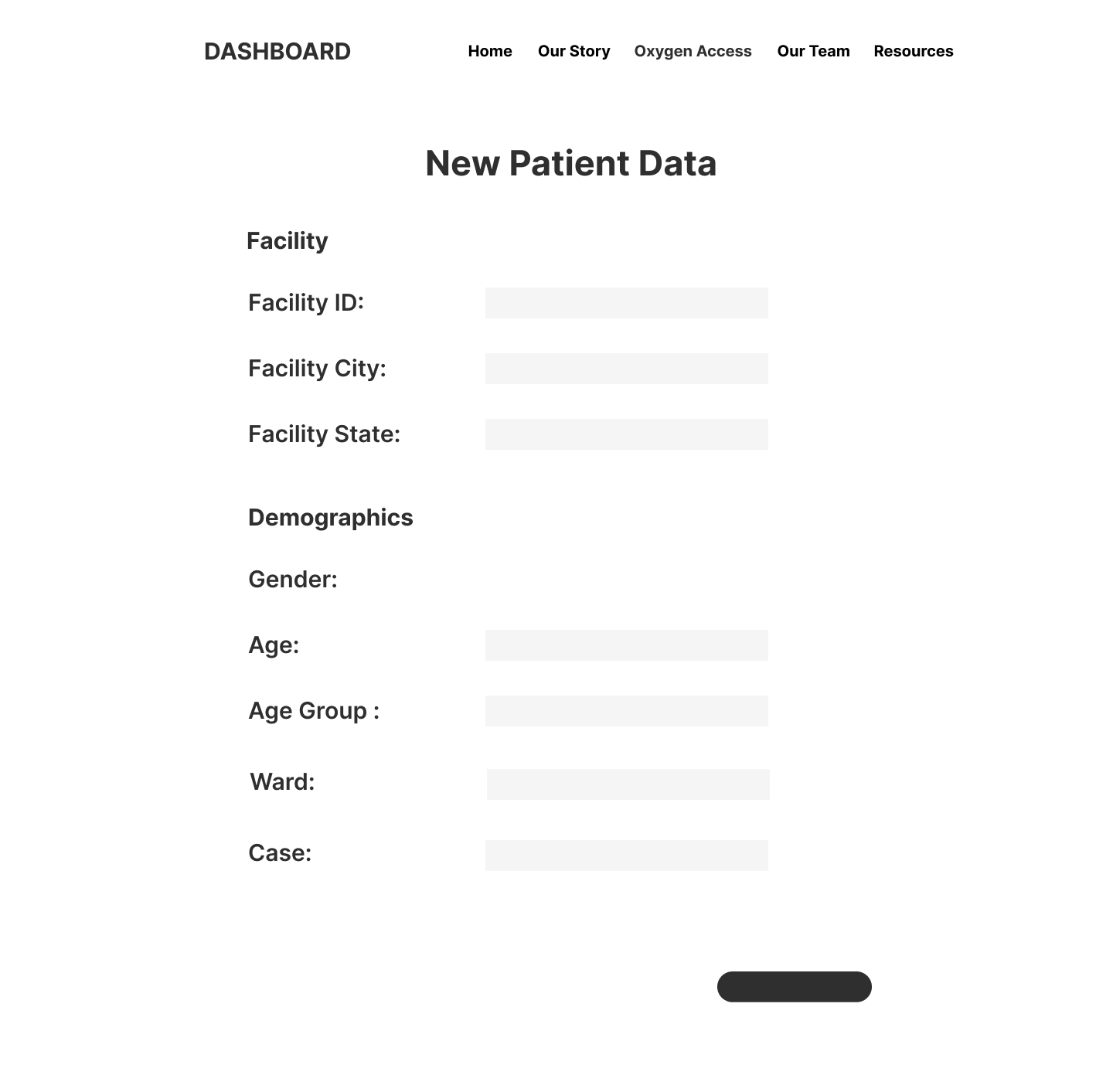
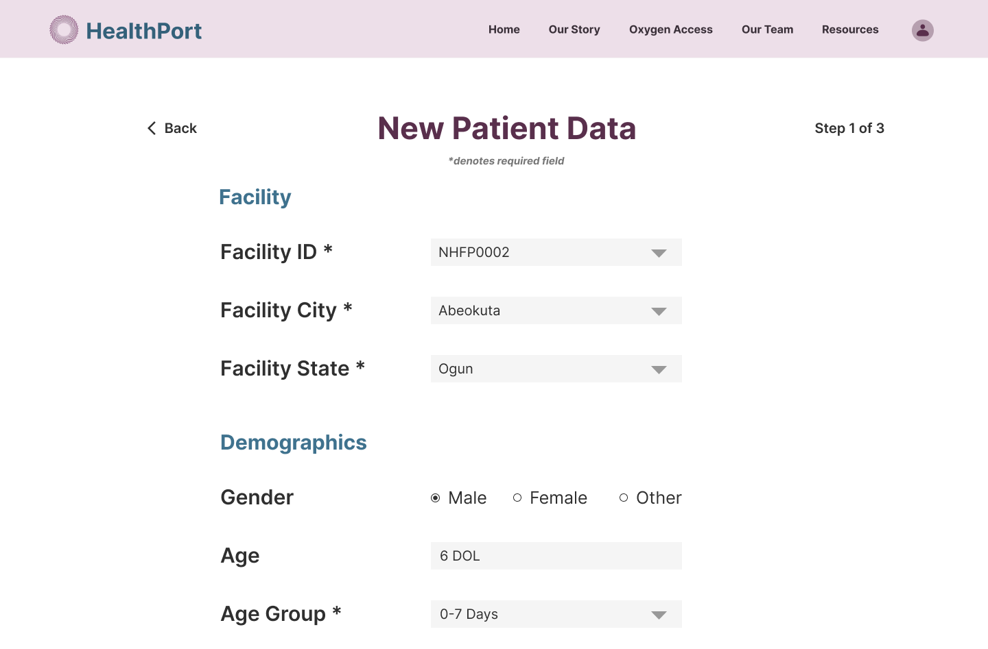
Data Entry Form
A data entry form for healthcare staff to enter information on equipment and patients
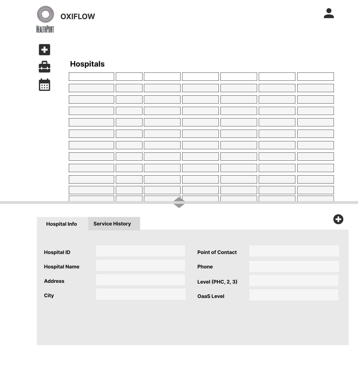
Summary Table
A backend summary table for healthcare staff to monitor and track patient and equipment data
Iterations
Low Fidelity Frames
Oxygen Dashboard
Need - User needs to find a location nearby that has oxygen available.
Key feature - List and Map view of Oxygen Locations
Justification - 100% of users expressed that they often don’t know if a location has oxygen available until they get there (user interviews)
Data Entry Form
Need - Clinical Support Staff needs to enter information regarding patient and equipment data.
Key Feature - Data Entry Forms for Both Patient Information and Equipment Information
Justification - Clinical Support Staff needs a way to enter critical data points about patient demographics and equipment status (business research)
Summary Table
Need - HealthPort needs a summary of the patient and equipment data
Key Feature - Data Table showcasing the data that was entered by Clinical Support Staff and able to search by certain criteria
Justification - HealthPort employees need summarized data to update live dashboard [Interface A] and track preventative and repair maintenance on equipment (business research)
Testing
Evaluating our Results
1
Click Rate
Less than 1% of users clicked on the toggle button to switch from map to list view. In our update we added text in the toggle itself to make this feature more apparent.
The Changes
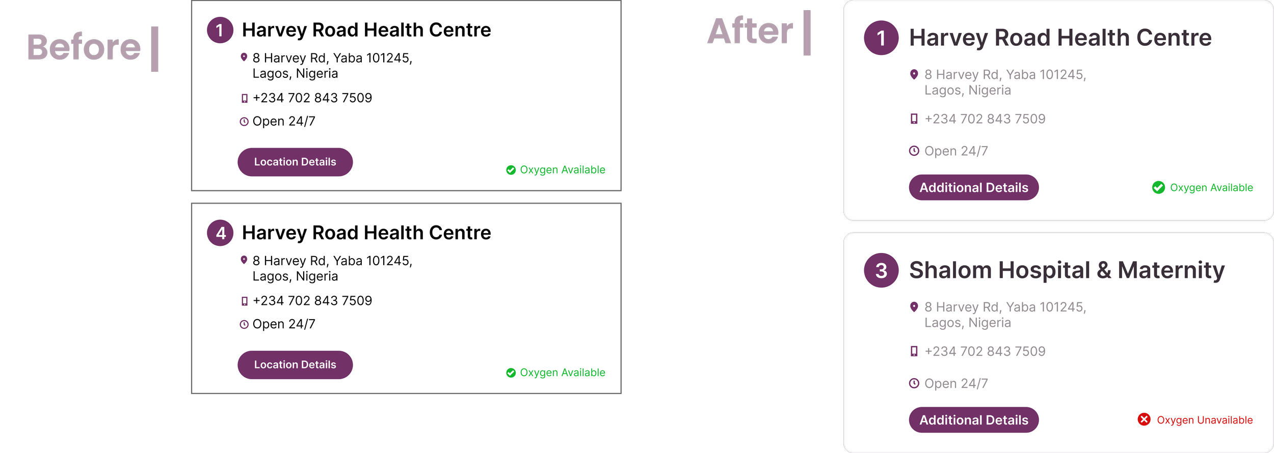
1. We altered the copy in the CTA from “Location Details” to “Additional Details” to show that there is more information provided than the address for each location.
After our idea was initially mapped out, we refined our designs and turned them into high fidelity wireframes. In order to assess our design, we tested the first iteration of our high fidelity design with 6 users and our testing resulted in 3 major callouts:
2
Success Rate
All users were able to fully complete the task of finding a hospital with oxygen. The largest instance of hesitation among users centered around the “Location Details” CTA. We changed the verbiage to “Additional Details” to give users a better idea of what information they will be getting by clicking the button.
3
Icon Clarity
Finally, our original icon to indicate oxygen availability was not clear to users, so we made an update to indicate both availability and unavailability.
3. We moved “Map” to the inside of the toggle and added “List” to differentiate between the map and list view.
2. We added an unavailable status to clearly differentiate if a location does or does not have a supply of oxygen
Final Iteration
Oxygen Dashboard
Data Entry Form
Summary Table
Final Thoughts
Next Steps
Testing Interface B with Clinical Support Staff. Due to the scope and timeline of this project, we were unable to go through usability testing with Interface B and C.
More detailed data on a percentage or the number of oxygen tanks that are available at each location.
Creating an offline dashboard. One thing that we discussed with HealthPort was that the internet access in Nigeria is lacking and that could be a potential barrier for patients trying to access oxygen.
Takeaways
1. Less is More
With different needs between patients, hospital staff and the client’s needs coming into play, our biggest strategy for this project was prioritizing what features we wanted to include and justifying this with our research. Due to the nature and scope of the project, it was important to stick to our “Must Haves” in order to create our MVP.
2. Harmony
Not only did my group work to create harmony between our ideas, the users’ needs and HealthPort’s wants, but we also had to coordinate the flow between the 3 separate interfaces of our solution. This was challenging at times, especially with the scope of the project, but making justified decisions allowed us to stay on track and maximize our solution.


